Étiquette : typography
-
CREATION, CONTRAINTES ET COMPROMIS
ON A TENDANCE À PENSER QUE TRAVAILLER SOUS LA CONTRAINTE DÉCUPLE NOTRE CRÉATIVITÉ.MAIS POUR CELA IL FAUT SE GARDER COÛTE QUE COÛTE D’ÉPUISER NOTRE EXIGENCE ET AINSI RISQUER DE SOMBRER DANS LE COMPROMIS NOUS DIT LE CRÉATEUR DES TYPOGRAPHIES VERDANA, GEORGIA ET TAHOMA MATTHEW CARTER. LA CONTRAINTE EST-ELLE GÉNÉRIQUE OU EXISTE-T-ELLE DIFFÉREMMENT SELON QU’ELLE SOIT…
-
MARIANNE MISPELAERE
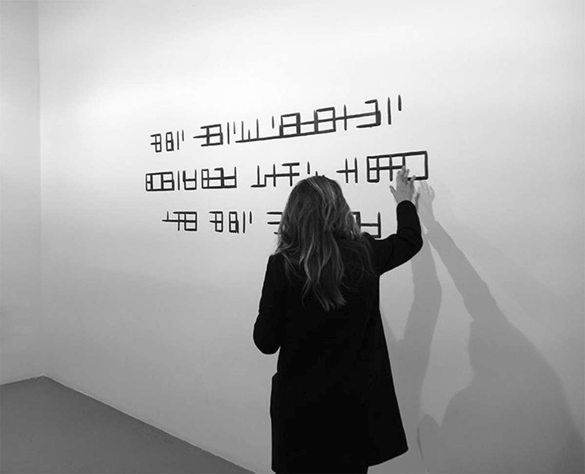
MARIANNE MISPELAERE, ARTISTE A DÉCOUVRIR ICI ET CE TRAVAIL « AUTODAFÉ » AUTOUR D’UNE TYPOGRAPHIE « EN CREUX », COMME MINÉE, MAIS QUI CONTINUE, POUR CEUX QUI SONT PRÊTS « À VOIR », À DIFFUSER SON MESSAGE. DOSSIER DE PRESSE
-
Ace Hotel NYC, a typographic journey
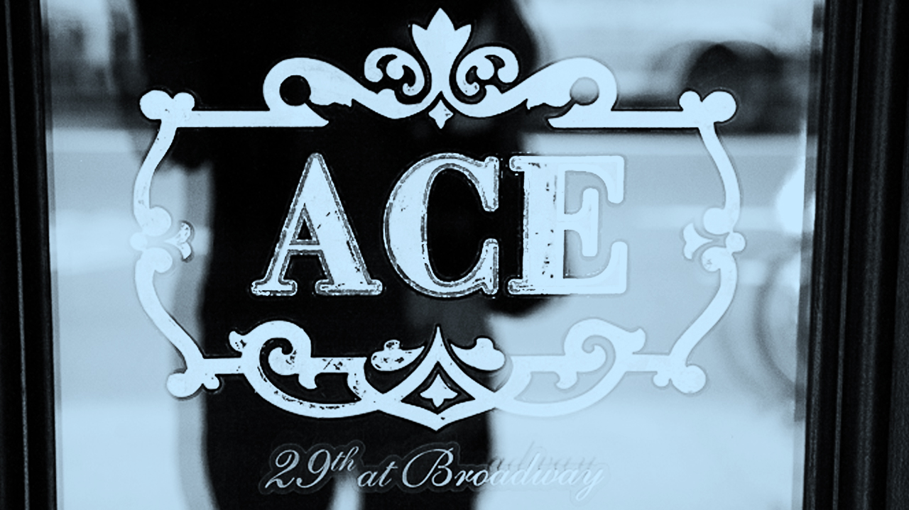
Ace Hotel NYC, 20 West 29th Street In Midtown Manhattan the wholesalers slowly leave the place to trendy boutiques like Maison Kitsuné. In a couple of year Midtown Manhattan will be the next spot for the trendsetters. Ace choose the heart of this district to open one of their hotel where the history of a…
-
The heat of summer | Phebus, the 70’s packaging
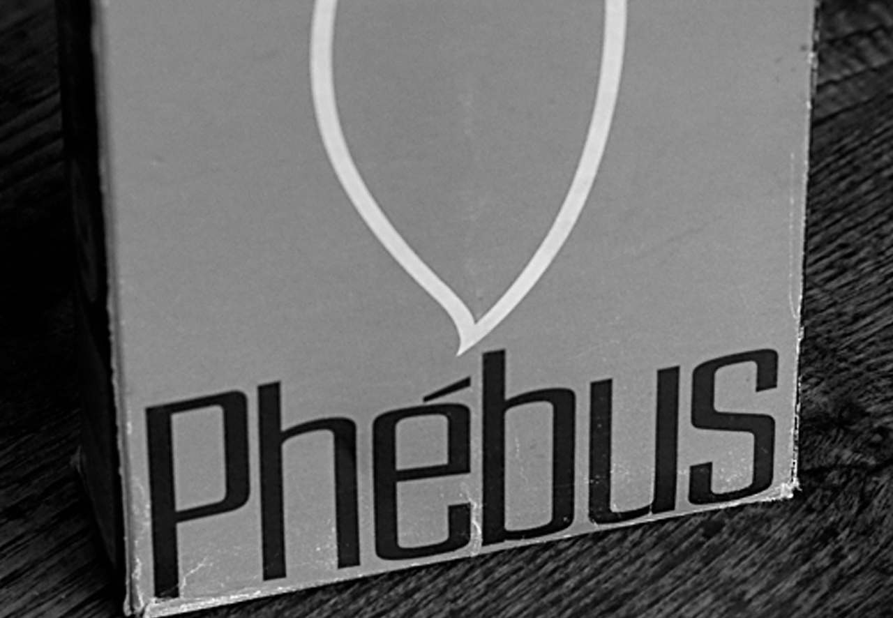
I found this old Phébus candles box… Phébus seems to be a famous french candles brand at the begining on the XXth century. I couldn’t find anything about the brand today, but it seems to be part of Bougies la Française (investigation needed). The box itself seems to have been printed during the early 80s…
-
Le Modalogue weekly #3

Le site de yourfriends et sur leur réalisation I type Berlin, la typo utilisée sur ce projet me rappelle un peu celle utilisée sur une invitation des Galeries Lafayette que j’ai reçue cette semaine. et puis aussi : WGSN style trends analysis by Juliet Warkentin Way of Women (WoW) a new perspective on women and…